
The Spotify Pie Chart is a fun, interactive tool that visualizes your Spotify listening habits into a colorful pie chart.
This viral web app has taken social media by storm, with users sharing their personalized ‘Spotify Pies’ across platforms like Instagram, Twitter, and TikTok.
In this comprehensive guide, we’ll explain what exactly the Spotify Pie Chart is, how it works, and step-by-step instructions to get your own pie chart.
What is the Spotify Pie Chart?
The Spotify Pie Chart is a third-party web application developed by Darren Huang, a student from UCLA. It analyzes your Spotify listening activity from the past month and generates a pie chart illustrating your top music genres.
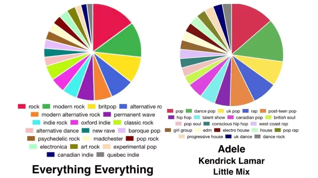
Each slice of the pie represents a genre you listened to, with the size of the slice demonstrating what percentage of your listening that genre took up. The more you listen to a genre, the bigger its slice in the pie chart.
Underneath the pie chart is a legend, matching each color to its corresponding genre. Hovering over a slice shows the genre name and your top artists for that genre.
Below the legend is also a list of your top artists for the month, ranked from most listened to least listened. The font size corresponds to how much you listened to each artist.
Unlike Spotify’s own Wrapped, which recaps your entire year, the Spotify Pie Chart updates monthly. This allows you to track how your listening habits change from month to month.
How Does the Spotify Pie Chart Work?
The Spotify Pie Chart works by utilizing the Spotify Web API to access data on your listening activity. Once you authorize the app and grant permission, it is able to pull your Spotify data to analyze your top artists, tracks, and genres for a given time period.
According to the creator’s GitHub page, the app specifically looks at your top tracks from the past month to determine your top genres. It calculates this by getting all the artists from your top tracks, figuring out each artist’s genre using the Spotify API, and tallying up the genre counts.
The genres are then sorted by play count and assigned a color. The color slices are sized proportionally based on the percentage of total plays each genre received.
How to Get and See Your Spotify Pie Chart

Ready to bake your own monthly musical pie? Here is a simple step-by-step guide to getting your Spotify Pie Chart:
- Visit the Spotify Pie Chart website in your web browser on your computer or mobile device.
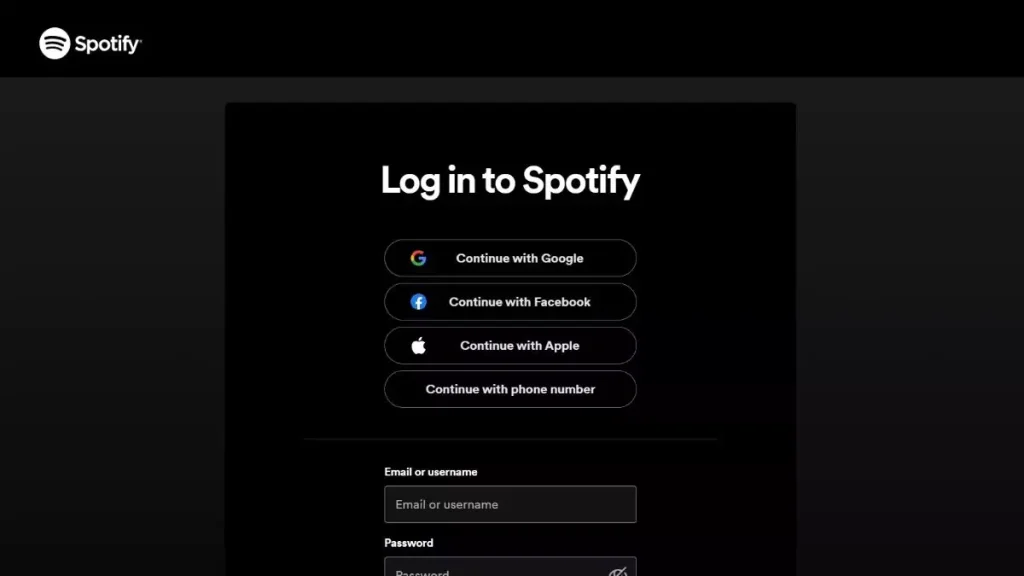
- Click “Log in to Spotify” and log in using your Spotify credentials. This grants the app permission to access your Spotify data.
- Accept the requested permissions. This allows the app to view your Spotify activity, specifically your top tracks from the last month.
- Your Spotify Pie Chart will be generated within seconds! The colorful pie graph will showcase your top genres and artists from the past month.
- Hover or click on each slice to see the specific genre and top artists contained in that slice.
- Scroll down to view your top artists for the month ranked in order.
- Screenshot or share your Spotify Pie Chart on social media or with friends! The website makes it easy to quickly share your personalized chart.
- Come back each month to get an updated snapshot of your latest music listening trends!
Try generating your own Spotify Pie Chart here!
Spotify Pie Chart 2023 Tips
- Only tracks listened to for over 30 seconds are counted toward your Pie Chart data.
- The Spotify Pie Chart updates monthly, so you can get a new chart every month.
- It only works for Spotify accounts and listening data. Those who use Apple Music, YouTube Music, etc. can’t generate a pie chart.
- If you listen to very niche genres, they may not show up on the chart if they fall outside Spotify’s genre categorization.
- There’s no native sharing function, but you can easily screenshot your chart to share across social media.
- Be aware you are granting access to your Spotify data. Revoke access anytime under Spotify’s App Settings.
Why Has the Spotify Pie Chart Gone Viral?
Music fans love digestible visualizations of their listening habits, which is part of why Spotify Wrapped has become such a viral annual event. The Spotify Pie Chart offers that same appeal, but with a few fun twists:
- Updated monthly: Offers a snapshot of your current listening trends, not just a yearly recap.
- Highly sharable: The colorful pie graph is designed for social media sharing.
- Specific genres: Includes ultra-specific genres for a detailed perspective.
- Interactive: Hovering shows your top artists for each genre slice.
Overall, the Spotify Pie Chart’s bite-sized, interactive, and shareable format makes it a hit with Spotify users who want to stay up-to-date on their listening stats all year round.
5 Benefits of Using the Spotify Pie Chart
Here are 5 key benefits of using the Spotify pie chart 2023 to analyze your listening habits:
1. Discover New Music Genres
Spotify’s pie chart displays what type of music you’ve been listening to. It shows both well-known and unique music styles. You might discover new genres that match your taste. The chart might show genres like an escape room, Christian Christmas, underground hip hop, or jazz fusion. Using this Spotify chart, you can discover and try out new styles of music.
2. Understand Your Listening Habits
Spotify’s pie chart gives you a clear picture of your music tastes. The size of each piece shows how much of that kind of music you listen to. You can quickly see which genres you listen to the most and others less so. This helps you understand your music habits. Are you stuck listening to the same types? Or is your music taste varied? The chart helps you examine your music choices.
3. Find New Favorite Artists
When you hover over each genre slice in your Spotify pie chart, it reveals your top artists for that specific genre. This makes it easy to discover new artists dominating genres you want to explore further. For example, hovering over the “vapor soul” slice might showcase top artists you haven’t heard before but would love based on your interest in that genre. The pie chart becomes your musical map of your new favorite artists.
4. Share Your Music Taste
The Spotify pie chart is great for social media posts. It displays your music taste bright and can be posted on Instagram, TikTok, Twitter, or any other platform. Friends and followers can see what music you like and suggest artists to you. Posting your music pie chart can help start conversations about music.
5. Track Listening Trends
Spotify’s pie chart changes every month according to your music choices. By checking it every month, you can see how your music tastes change. You can see if you listen to different genres each month or stick to the same one. This chart shows your music choices and helps you understand your music taste. Check it every month to stay updated.
Get Your Monthly Music Pie
The Spotify pie chart serves up both discovery and self-reflection about your music taste. So head to the Spotify Pie website to bake your own today. The colorful, shareable pie makes digesting your streaming data delicious. What will your slice reveal about your music taste DNA?
Also read: Spotify Color Palette: What Is It & How To Find Your Spotify Color Palette
Other Ways to Visualize Your Spotify Listening Stats
In addition to the viral Spotify Pie Chart, there are a number of other web apps that offer cool ways to see and share your Spotify listening data:
- Receiptify: Generates a receipt of your top tracks or artists from the past month, 6 months, or all-time.
- Instafest: Creates a shareable fake music festival lineup poster featuring your top listened-to artists.
- Obscurify Music: Ranks how “obscure” your music taste is based on your Spotify data.
- Spotify Wrapped: Spotify’s official yearly recap of your top songs, artists, genres, and listening minutes.
- Last.fm: Scrobbles your listening data across platforms to provide listening reports and stats.
So explore some of these other tools if you’re looking to switch up the visualization style for your Spotify listening stats!
FAQs
Is Spotify Pie Chart free to use?
Yes, Spotify Pie Chart is free to generate and use. You just need a Spotify account.
Can I use the Music Pie Chart without a Spotify?
No, Spotify Pie Chart specifically analyzes Spotify data, so you need a Spotify account. It doesn’t work for other music platforms.
Is Spotify pie chart safe?
Yes, Spotify Pie Chart is safe to use. It only accesses your Spotify listening data and doesn’t collect any other personal information.
How to make a Spotify pie chart?
Go to https://huangdarren1106.github.io/, log in with Spotify, grant access, and your pie chart will instantly generate based on your last month’s listening data.
How to do your Spotify pie chart?
Visit https://huangdarren1106.github.io/, login to Spotify, and allow access to your listening history, your personalized Spotify pie chart will be created within seconds.
Conclusion
The Spotify Pie Chart is a fun new way for music fans to visualize the genres and artists that make up their monthly listening habits on Spotify. With its interactive and shareable format, it’s easy to see why the Spotify Pie Chart has quickly gone viral across social media.
So try baking your own and let your Spotify Pie Chart spark some music discovery and conversations among friends.
Just remember that you are granting access to your Spotify data, so be sure you are comfortable with that before using this or any third-party Spotify app.